
Color blocking is a bold, contemporary technique in interior design that involves combining blocks of solid colors in a single space to create visual interest, depth, and structure. Originally popularized in fashion, this design method has found its way into interiors, offering a modern and dynamic approach to color application. When executed thoughtfully, color blocking can transform a room, adding drama, personality, and style. However, to achieve a balanced, harmonious look, it’s essential to approach color blocking with intention and precision. Below is a guide on how to make color blocking work in your home, ensuring the space remains both striking and cohesive.
1. Understand the Basics of Color Blocking
Color blocking in interior design involves the strategic use of contrasting or complementary colors to create defined zones or sections within a space. The technique can be applied to walls, furniture, decor, and even textiles. The aim is to break up the monotony of neutral or single-color schemes by introducing blocks of vivid hues, often in geometric or linear patterns.
To begin, consider the color wheel: hues that are opposite to each other, such as blue and orange or red and green, create a vibrant contrast, while adjacent colors like blue and purple or yellow and green evoke a more harmonious, serene feeling. The key is to find a balance between contrast and harmony to prevent the space from feeling chaotic or overwhelming.
2. Choose the Right Color Palette
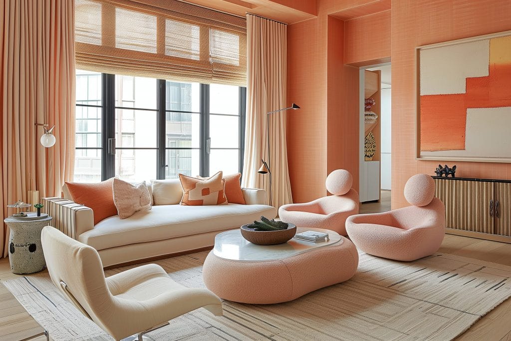
The success of color blocking largely depends on the palette you choose. Opt for colors that not only complement each other but also suit the room’s mood and purpose. For example, in a bedroom, muted tones like dusty pinks and soft greys can create a relaxing atmosphere, while in a living room or dining area, bolder contrasts like navy blue and mustard yellow can add energy and vibrancy to the space.
When selecting colors, it’s crucial to consider the size and lighting of the room. Lighter shades like pastel yellows and pale blues can open up smaller spaces, making them feel larger and airier. On the other hand, deep jewel tones, like emerald green or ruby red, can work well in larger rooms or areas that benefit from a cozier, more intimate atmosphere.
One helpful approach is to limit your palette to three main colors—one dominant, one accent, and one neutral—to prevent the space from feeling too busy. A neutral color such as white, grey, or beige can serve as a grounding element, allowing the bold hues to stand out without clashing.
3. Use Color Blocking on Walls
Walls are one of the most common places to implement color blocking, and there are a variety of ways to do so. One simple yet impactful technique is to divide the wall into geometric sections, painting each section a different color. This works particularly well with rectangles, squares, or triangles, which add a sense of order and structure to the space.
Another method is to use color blocking in an ombré effect, where one color gradually fades into another. This technique creates a softer, more subtle contrast while still offering visual interest. You can also experiment with creating a “frame” effect around certain areas, such as a door, window, or painting, with bold, contrasting colors to highlight those features.
For more dramatic impact, consider accent walls that utilize contrasting blocks of color. For instance, you might paint one section of the wall in a deep, bold color like indigo, while the adjacent sections are painted in lighter tones of grey or white. This method draws the eye and makes a striking statement, especially in open-plan living areas.
4. Incorporate Color Blocking with Furniture and Decor
Color blocking isn’t limited to walls. Furniture, decor, and textiles are all excellent opportunities to incorporate this bold design element. A sofa in a solid block of color can serve as the focal point of a living room, especially when paired with throw pillows in complementary or contrasting shades.
Consider using a combination of colorful chairs around a dining table or grouping different hues of the same color family, such as turquoise, teal, and aqua, for a cohesive yet dynamic look. Mixing and matching vibrant colors on furniture pieces can create a playful, modern aesthetic without overwhelming the space.
Textiles like rugs, curtains, and cushions are also key players in color blocking. For example, a large, patterned area rug with bold color blocks can tie a room together, creating a sense of cohesion while adding visual excitement to the floor. Similarly, colorful curtains or a brightly colored throw blanket can work to define different areas within an open-plan space, contributing to the overall sense of structure.
5. Mix and Match Patterns with Color Blocking
One of the more advanced techniques within color blocking is mixing patterns with solid blocks of color. Combining geometric patterns, such as stripes, triangles, or squares, with blocks of solid colors can introduce an element of sophistication and creativity. However, balance is key—if one area of the room is dominated by intricate patterns, allow the solid-colored blocks to provide a visual break.
For example, a geometric-patterned rug in tones of blue and orange can pair beautifully with solid-colored cushions or an accent chair in a single contrasting hue like yellow or navy. By doing so, you create a cohesive narrative without the space feeling too chaotic or busy.
For those who enjoy a more minimalist aesthetic, pairing simple, monochrome patterns with solid color blocks is a great way to achieve a sleek, modern look. Think black and white stripes on a pillow paired with a block of rich red on the wall or sofa.
6. Embrace the Power of Accents
Color blocking doesn’t have to overwhelm a space; it can also be used in more subtle ways to enhance the overall design. Accent pieces such as vases, picture frames, and lamps can be used strategically to introduce small, intentional blocks of color that add dimension and interest to a room.
For example, a statement vase in bright yellow or electric blue can act as an accent piece that complements the room’s overall color scheme without dominating the space. Similarly, pairing a brightly colored lampshade with a neutral base can create a striking focal point while maintaining a balanced, elegant look.
7. Test Your Design First
Before committing to any color blocking project, it’s always wise to test your chosen colors in the space. Use sample swatches of paint or fabric to see how the colors look in different lighting conditions and how they interact with the furniture and decor already in the room. This will give you a clearer sense of how the colors will come together and ensure the final result is as impactful as you envision.
If you’re experimenting with color blocking on the walls, use painter’s tape to outline the areas you plan to paint, helping you visualize the final effect. This can also help ensure clean, crisp lines for a professional finish.
8. Keep Balance in Mind
While color blocking is all about making bold statements with color, balance is essential to avoid overwhelming the space. Ensure the design is visually balanced by distributing colors evenly throughout the room. If one wall is painted in a bold shade, balance it out with neutral-colored furniture or decor on the opposite side. Mixing solid color blocks with lighter, neutral elements will maintain harmony and prevent the space from feeling too bold or heavy.
Conclusion
Color blocking is a fun and creative way to infuse personality and modernity into your home design. By understanding the principles behind this technique, such as choosing a complementary color palette, applying it to walls, furniture, and decor, and maintaining balance throughout the space, you can transform any room into a visually compelling and harmonious environment. Whether you want to create a statement or simply add depth and structure to your interior, color blocking offers endless possibilities for designing spaces that are as functional as they are stylish.

